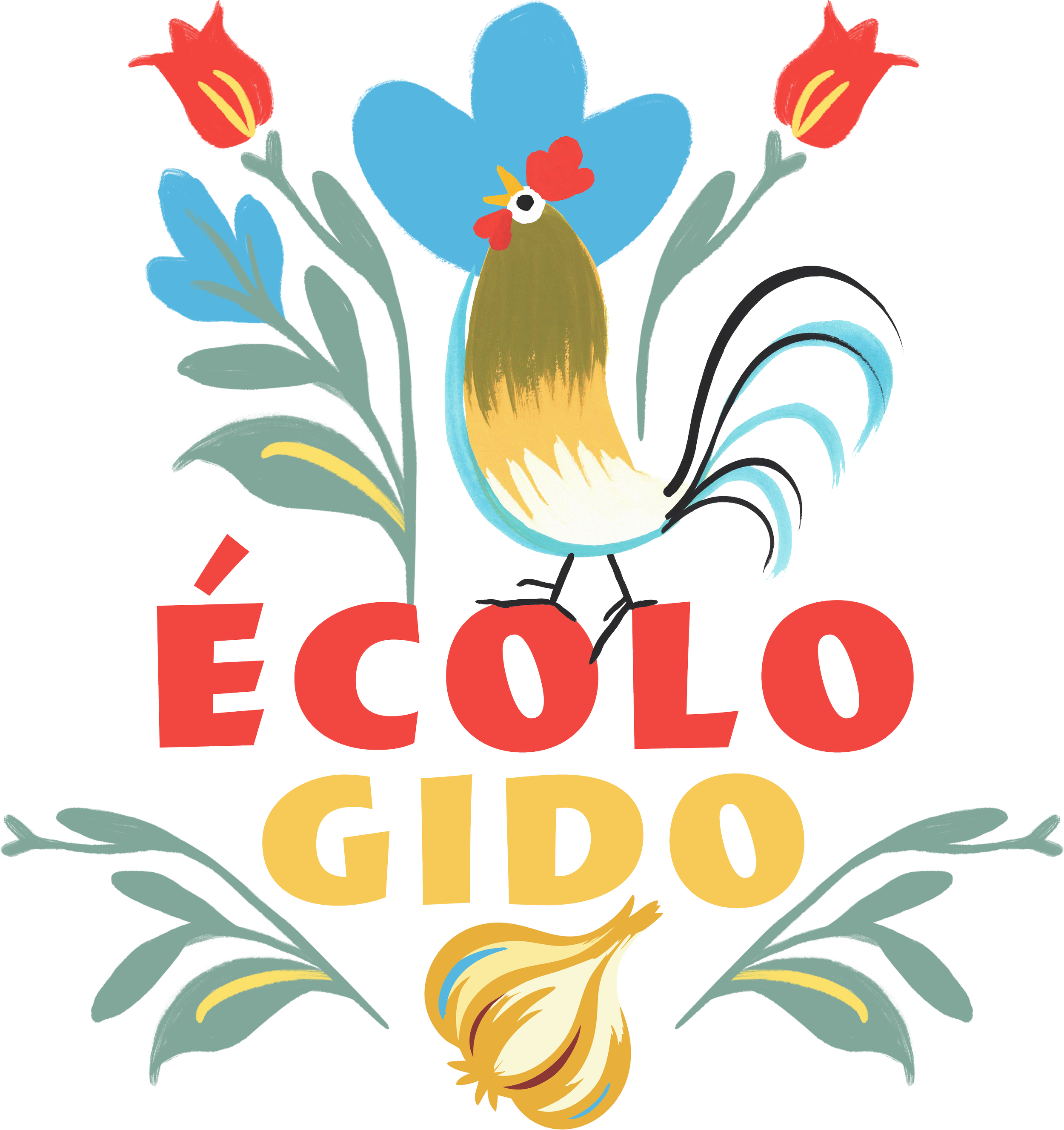
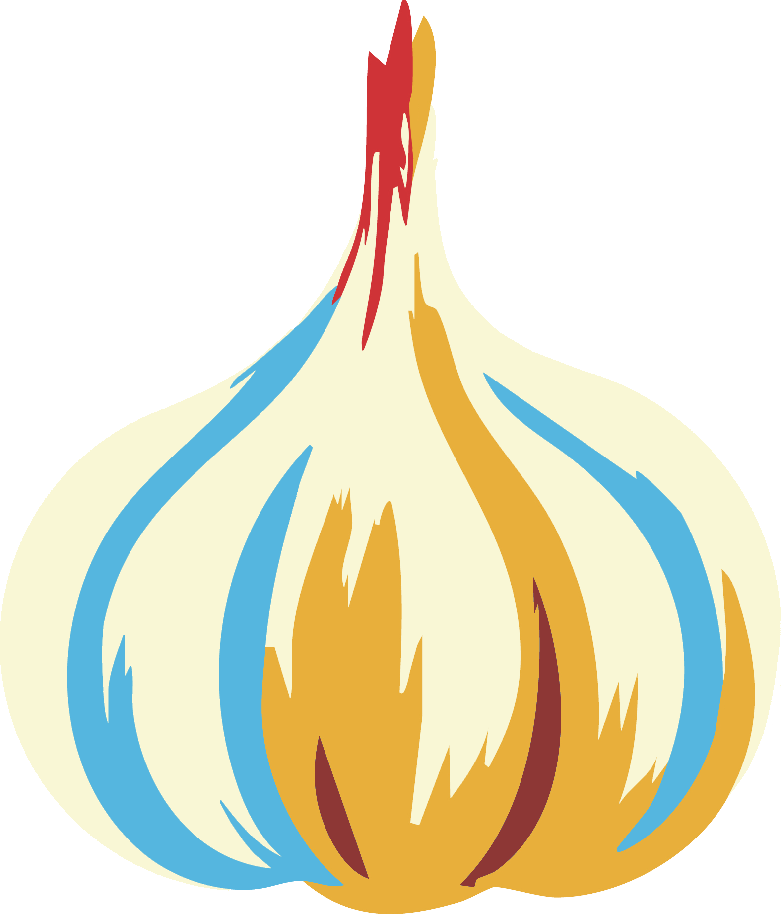
Built around a family-grown strain of Ukrainian garlic, Écolo Gido and Hot Dunkin are sibling brands rooted in family history, and regional agriculture. Drawing on heritage and a contemporary ecological ethos, the branding was built from hand-drawn illustration, bold colours, and traditional references.
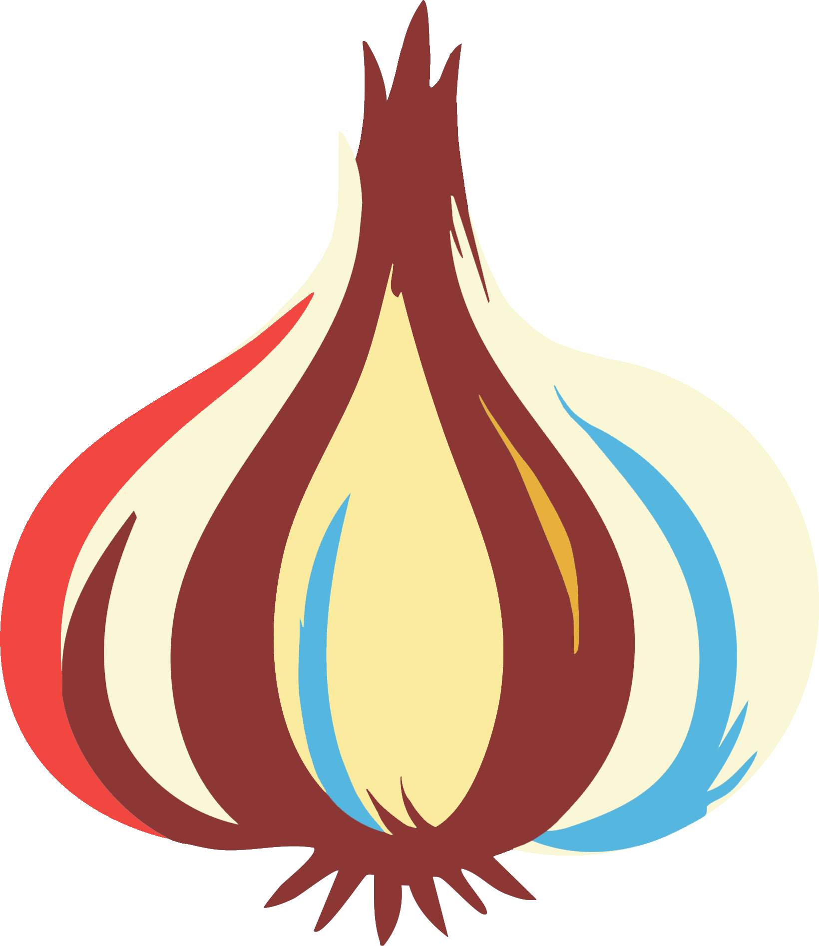
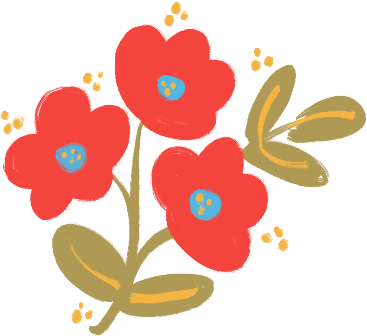
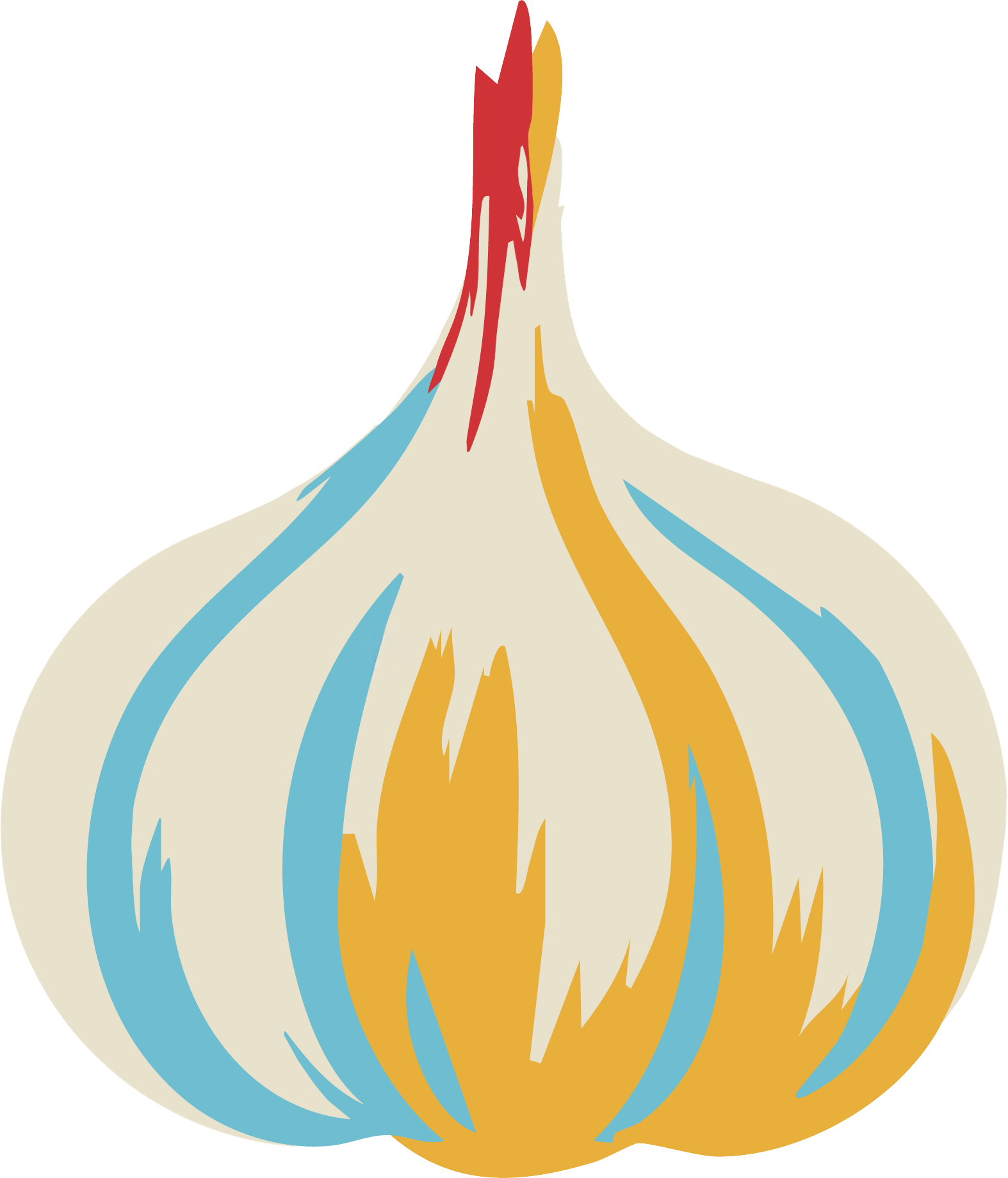
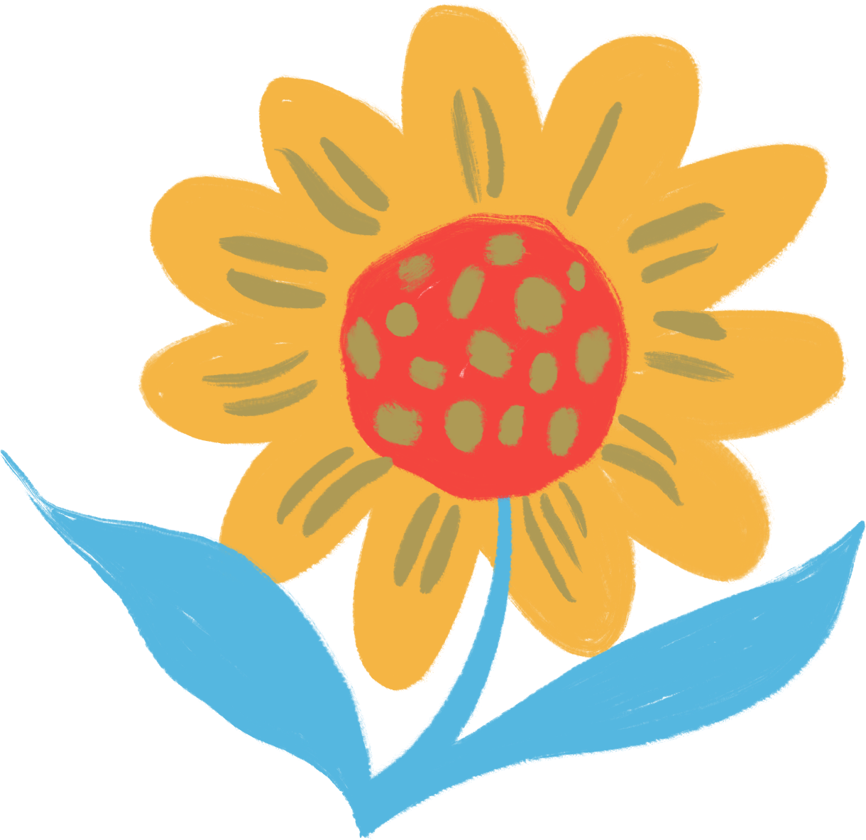
additional visual assets


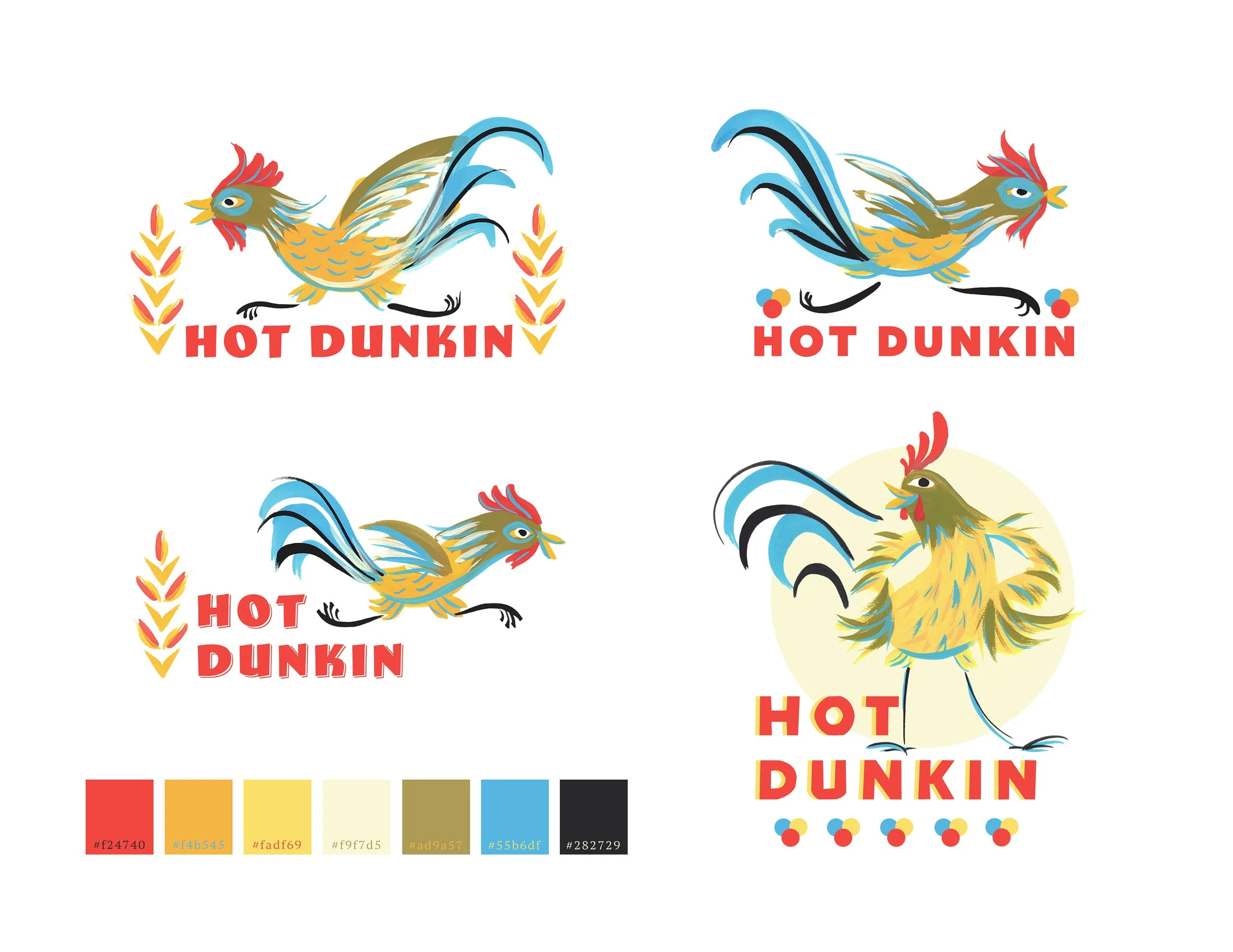
mock ups using colours
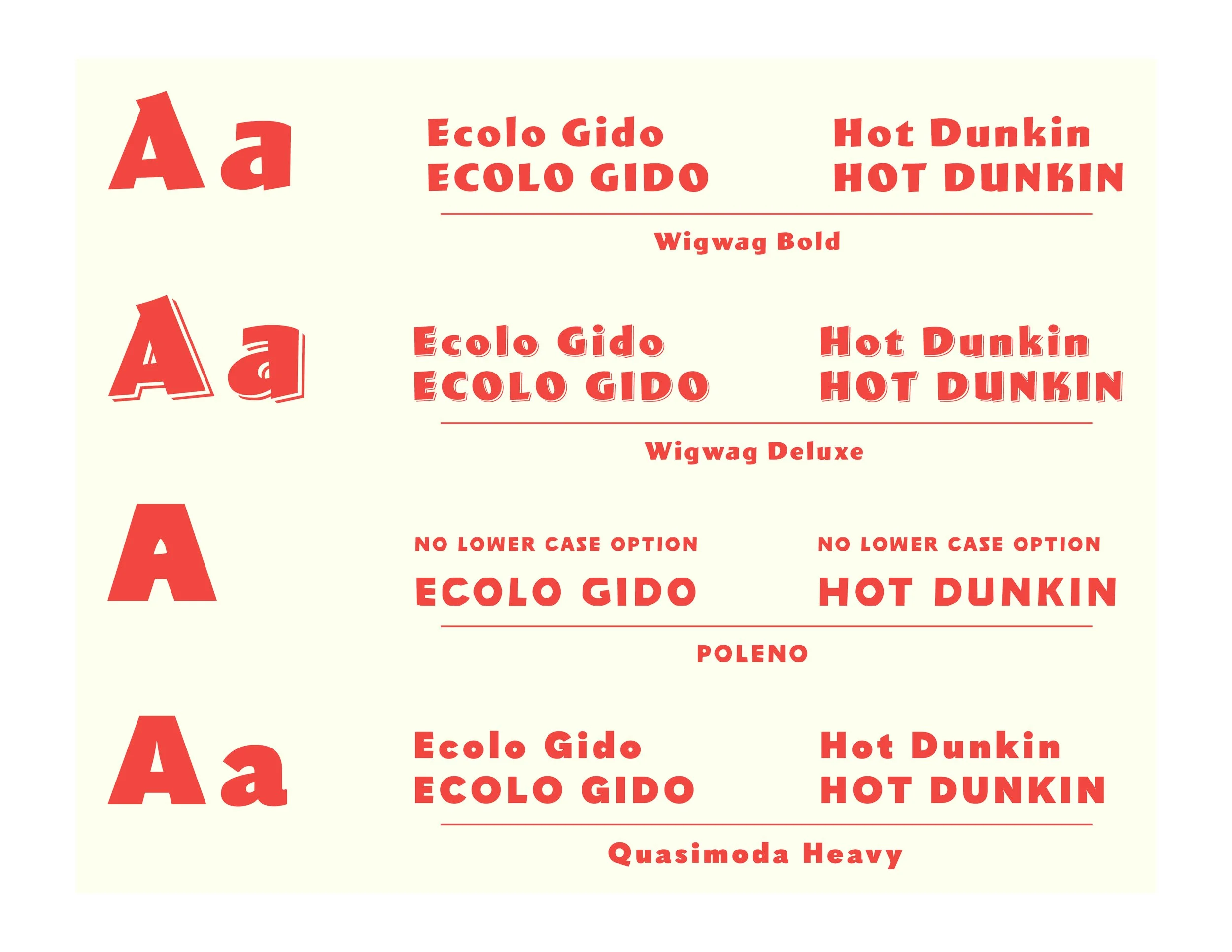
font recommendations
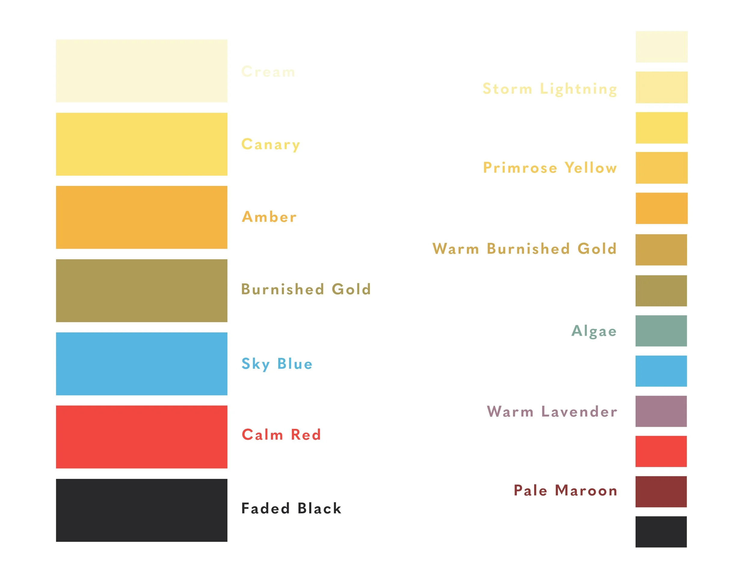
colour palette & secondary colours
alternative logo
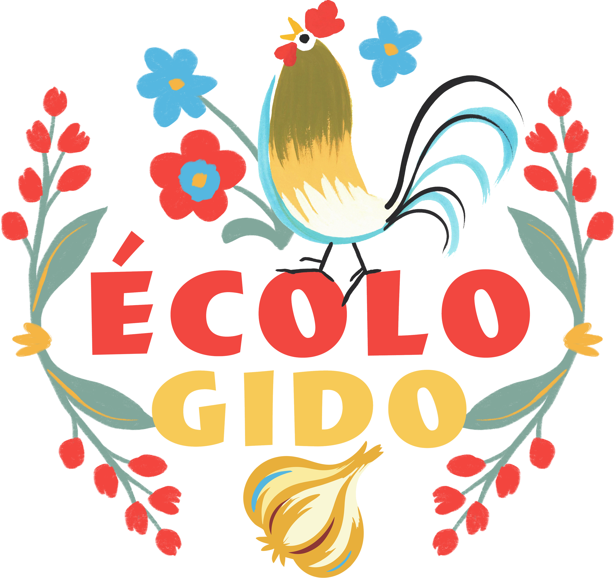
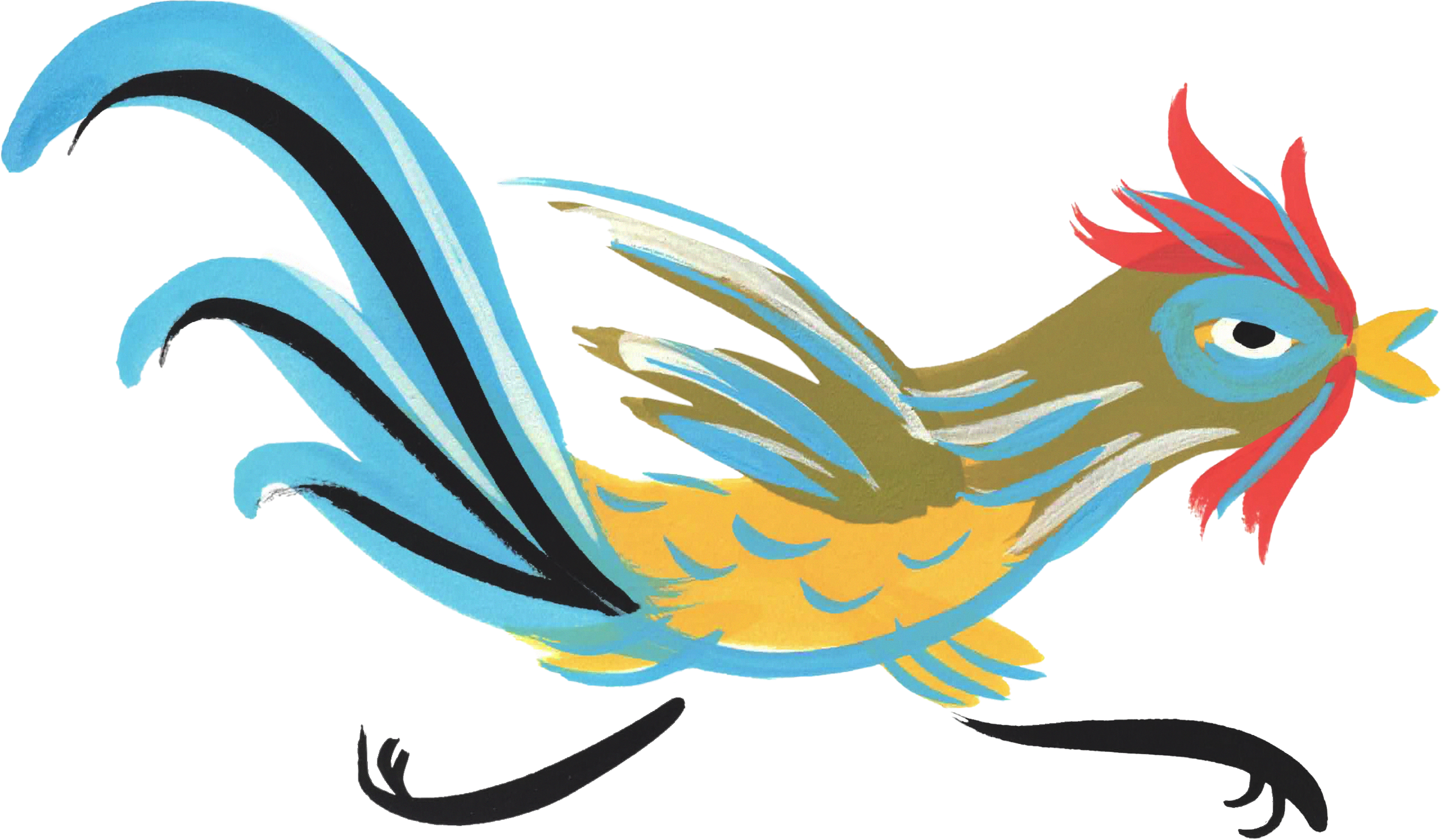
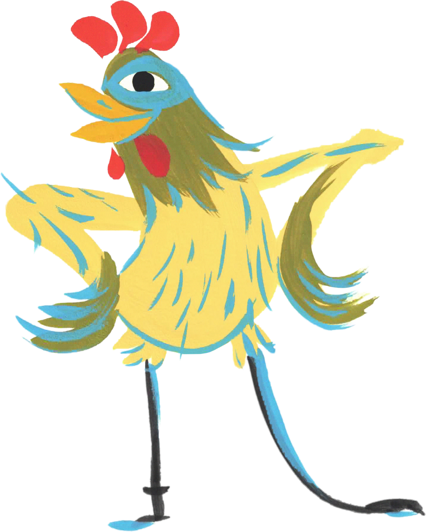
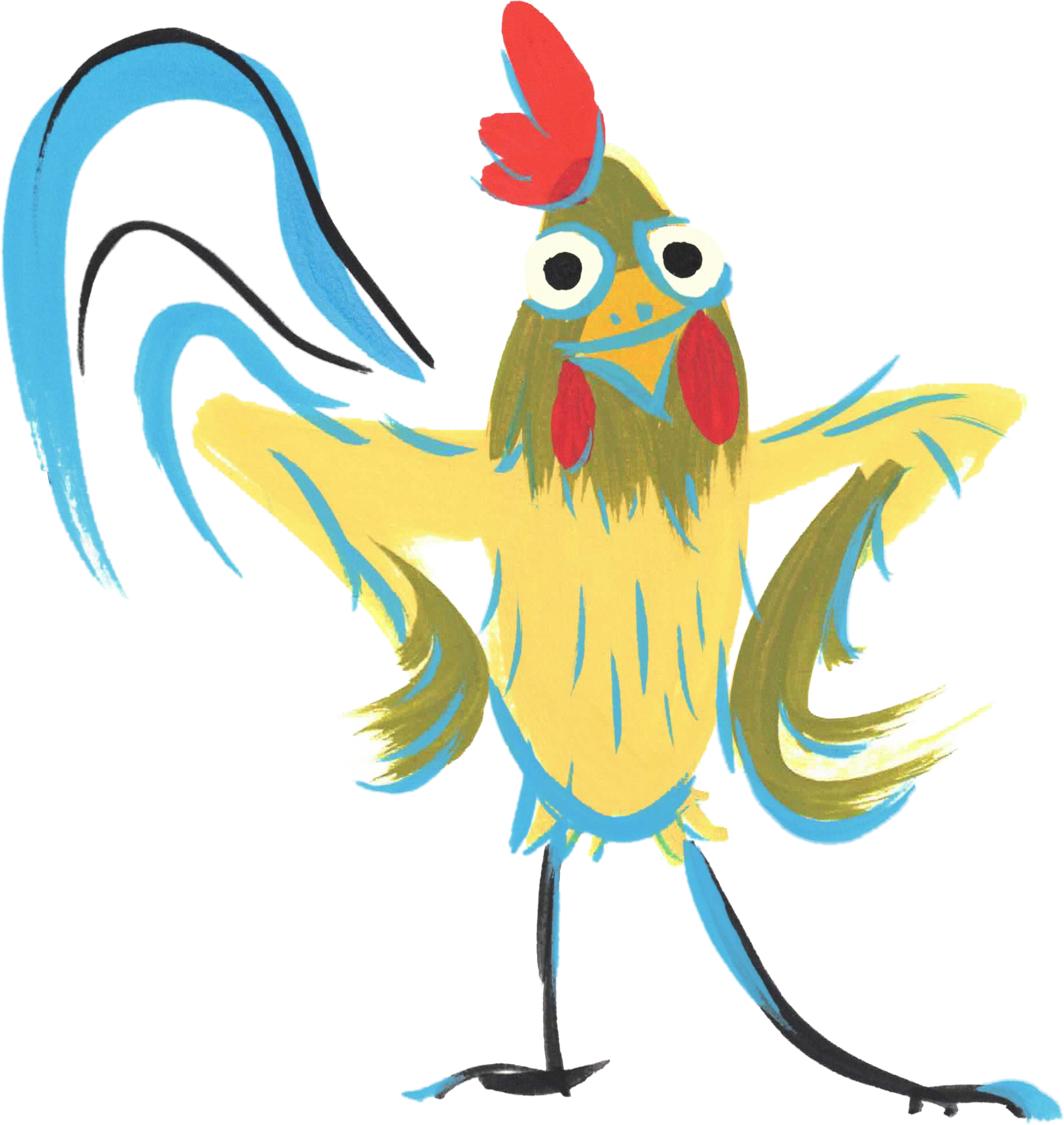
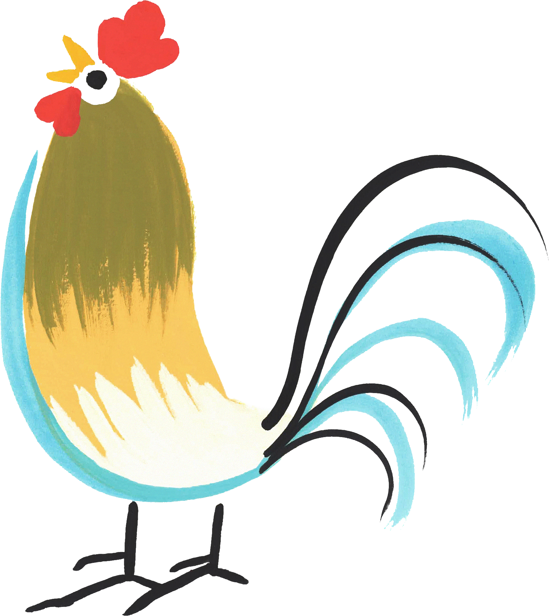
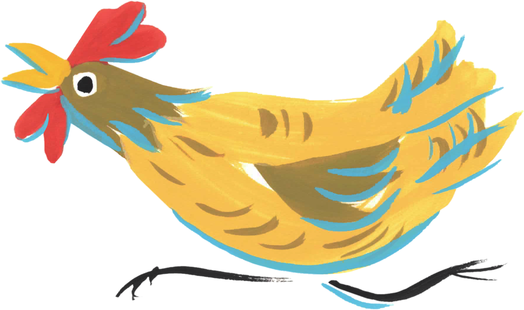
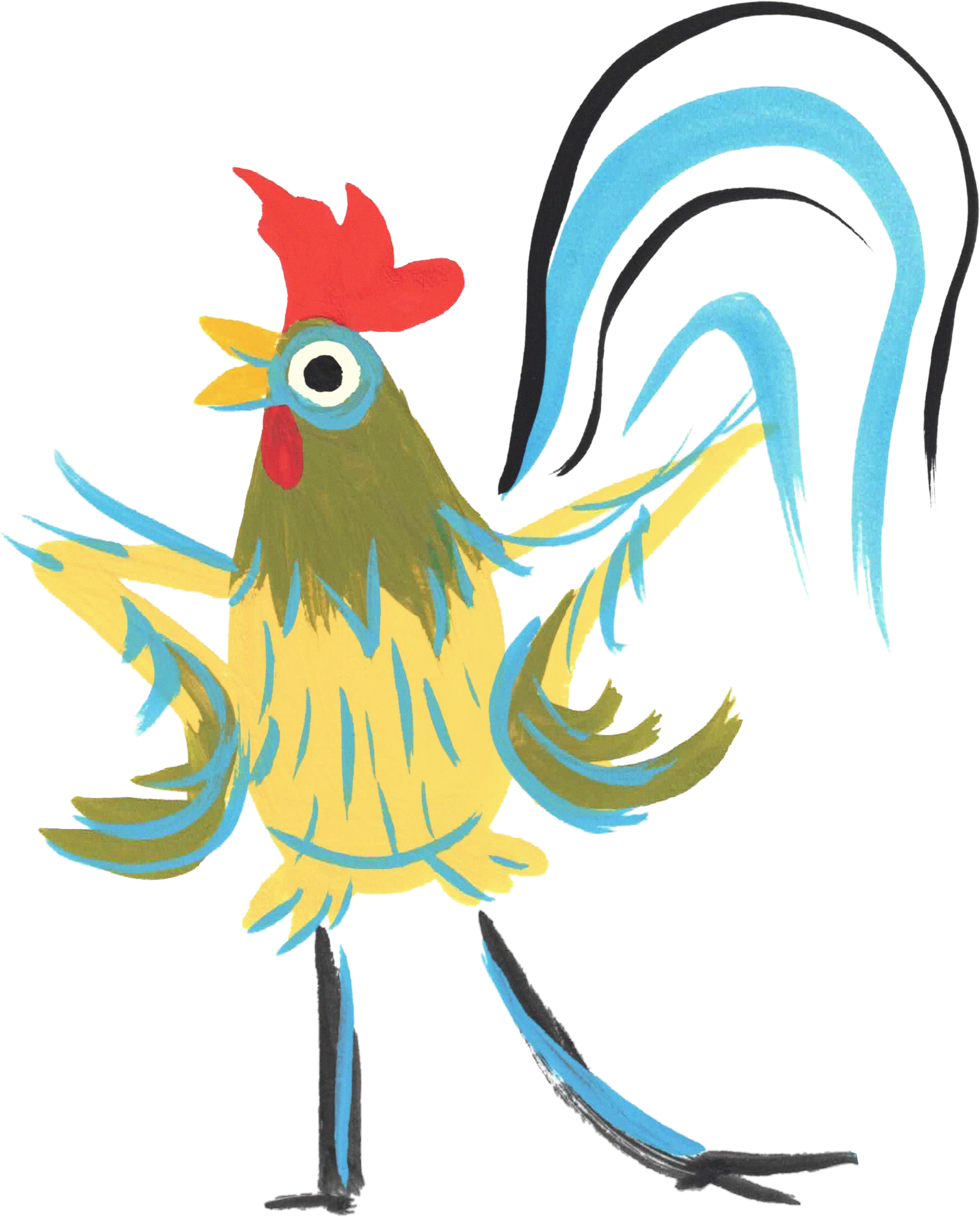
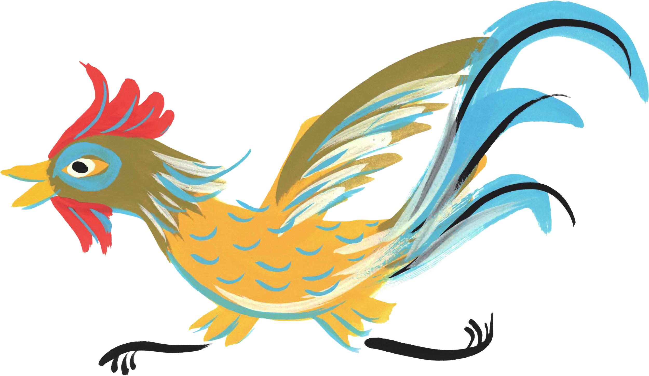
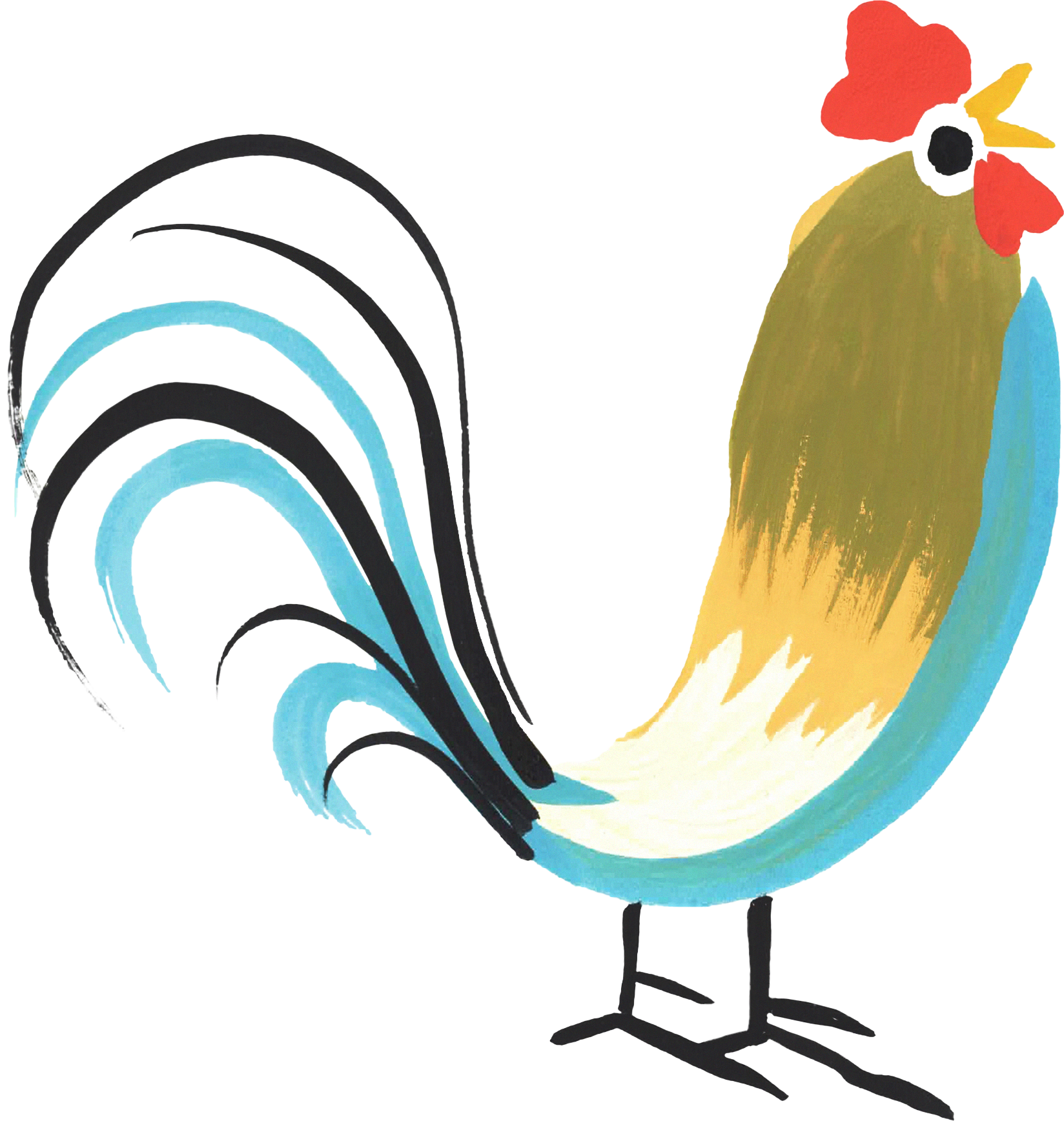
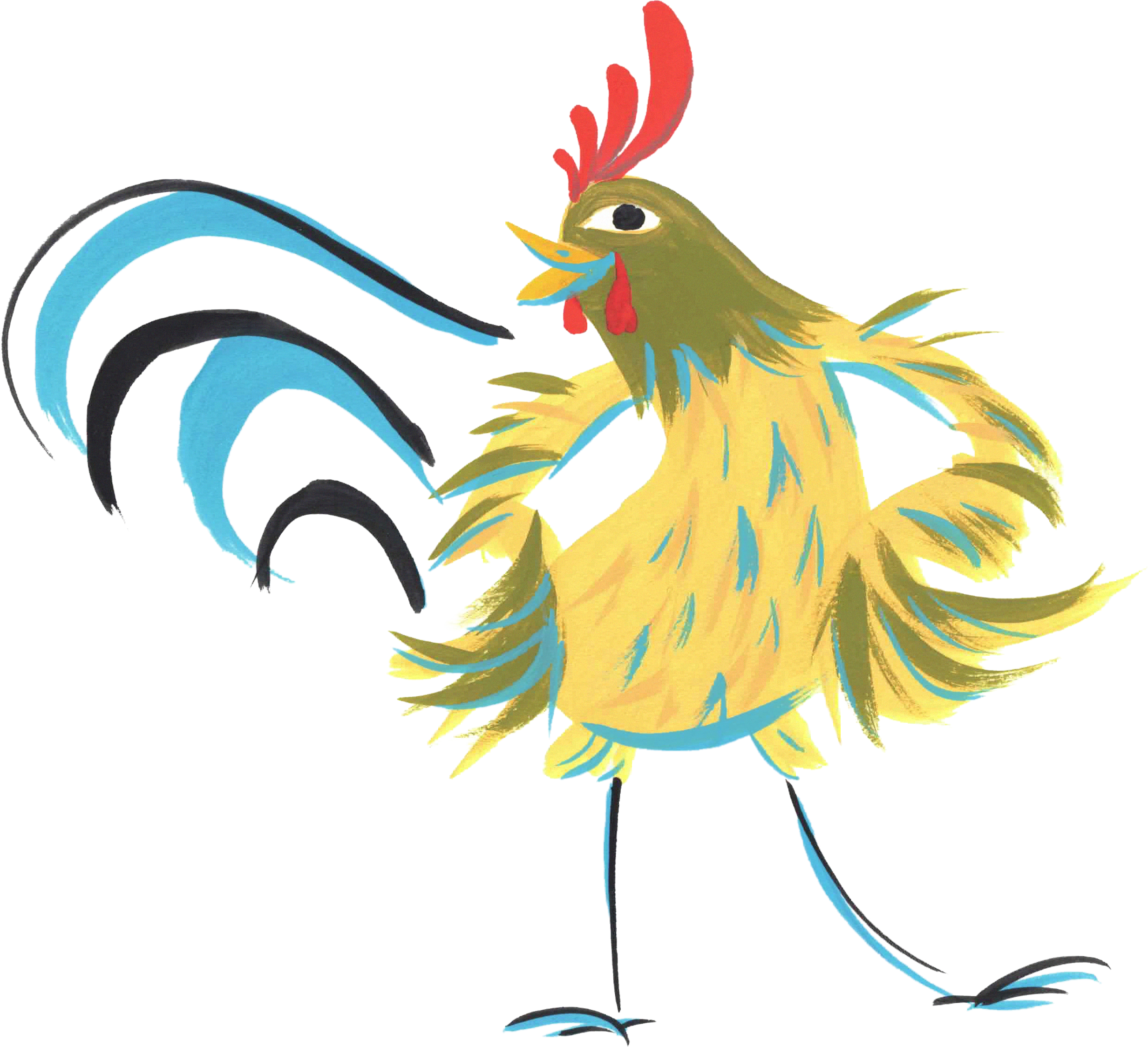
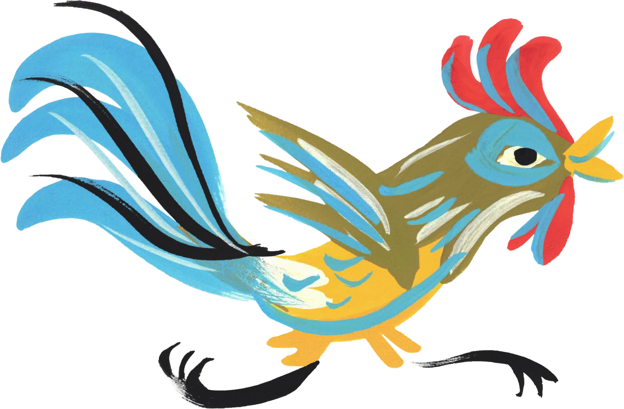
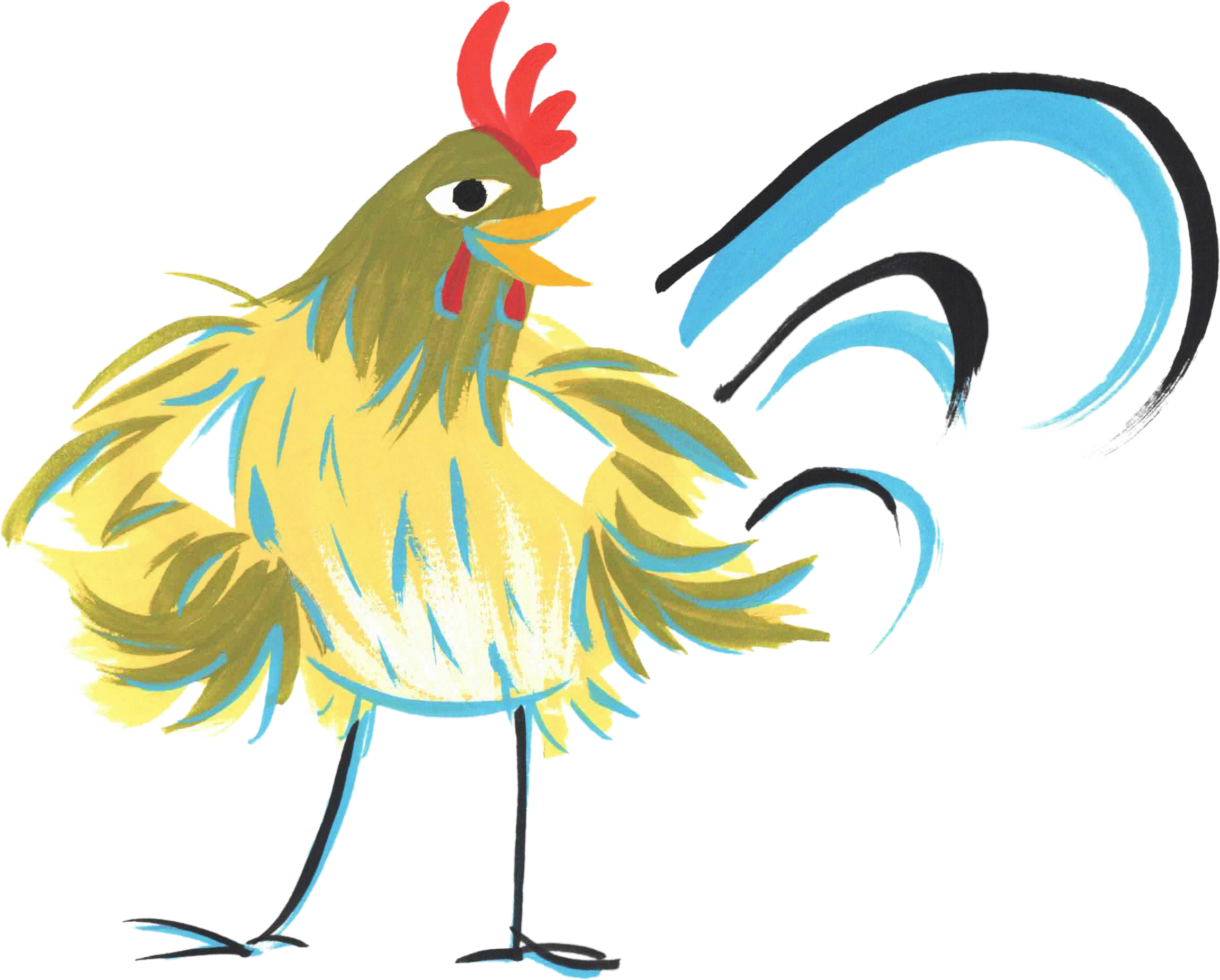
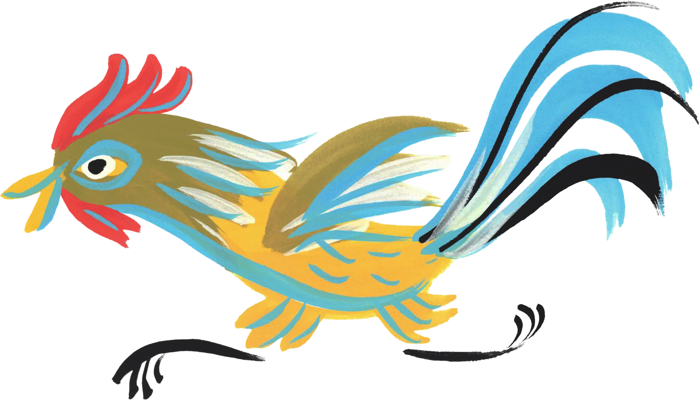
Illustrations by Kate Lawrence
The chickens below were provided by the client and used as the foundation for the Écolo Gido and Hot Dunkin branding. They were then adapted, refined, and integrated into into the broader visual identity across both brands.